
Design decisions that can't quietly erode
Ratā is a design system for web apps and websites — 30 components across eight families, sitting on a token layer that can retheme the entire system from a handful of decisions. I designed and built every layer of it: the tokens, the accessibility behaviour, the components, the documentation site, and the process for adding to it.
Design systems rarely fail at launch. They erode. A colour gets hardcoded because the right token was hard to find. A focus ring gets removed because it clipped a layout. A second button style appears because nobody knew the first one already handled it. Every one of those is small, and every one is defensible on the day. Six months later the system describes something nobody is building any more.
So the question I designed around wasn't how to document the rules. It was how to make the rules hold. Contrast is re-measured on every build. Components are checked against the API that was actually approved. When a decision stops being true, the system fails loudly instead of drifting quietly.
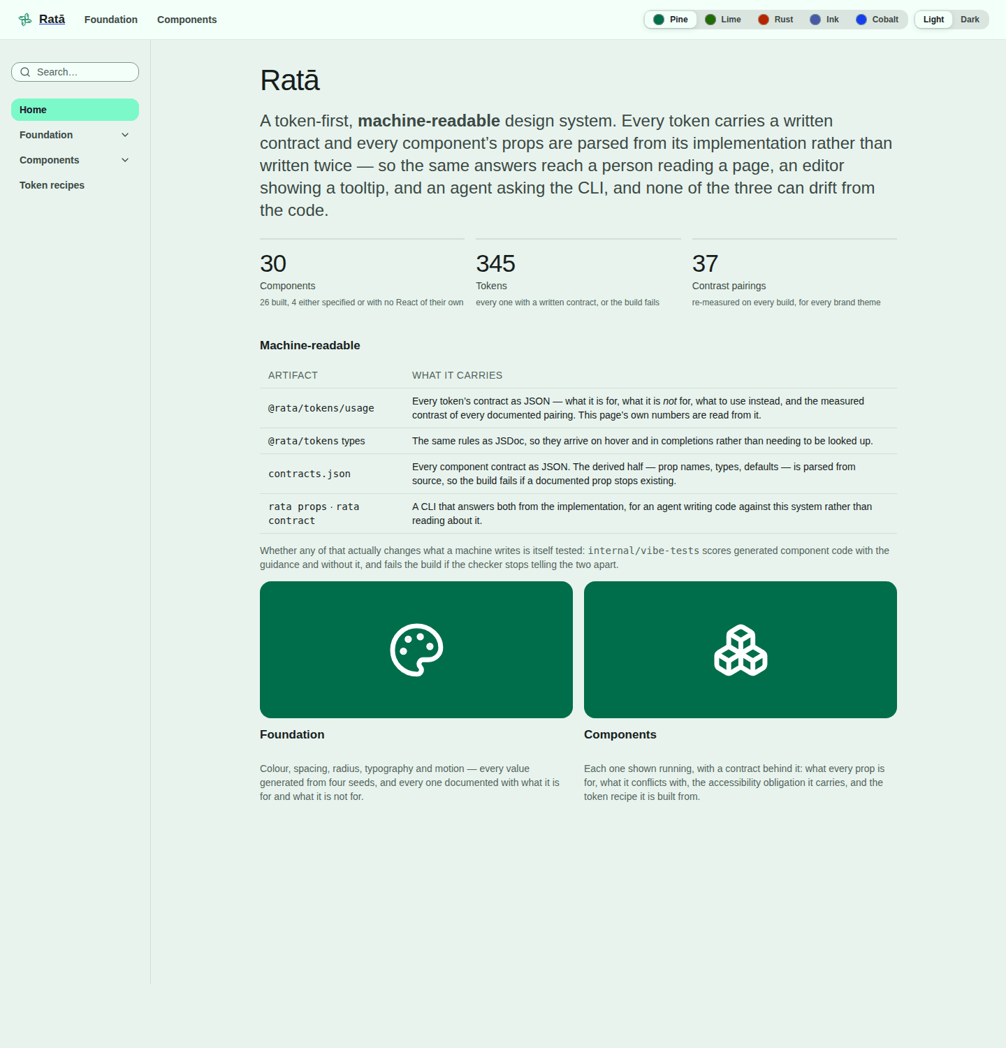
30
components in the registry, 26 fully built
7
brand themes from the same tokens
37
contrast pairings verified every build
345
documented design tokens
A component is more than how it looks
The hard part of a component was never the visual design. It's what the thing means — which decision it represents, when to reach for something else, and what using it obliges you to do. That knowledge usually lives in a designer's head, gets explained in review, and is lost the moment someone new picks the component up.
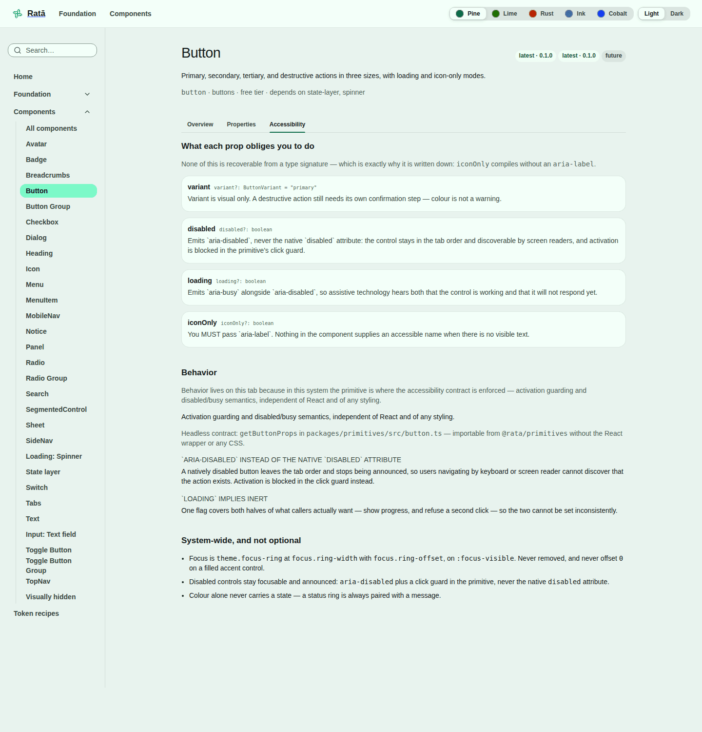
In Ratā every component carries that reasoning as part of the system itself. Each option is documented with what it's for, what to avoid, what it conflicts with, and what it requires for accessibility. These are real rules from the button's contract:
Two primary buttons in one view — the tier is a claim about priority, and two claims cancel out.
variant · don't
Shrinking to sm to fit a cramped layout — fix the layout budget instead.
size · don't
Variant is visual only. A destructive action still needs its own confirmation step — colour is not a warning.
variant · accessibility
Any action whose icon is not already conventional — an unlabelled novel icon is unreadable.
iconOnly · don't
None of that can be read off a screenshot or a type signature, and all of it is what goes wrong when someone reaches for a component in a hurry. The half of a contract that can be read from the code is read from the code; the half that is judgement is written by me — and the build refuses to let the two disagree.
Accessibility that can't regress quietly
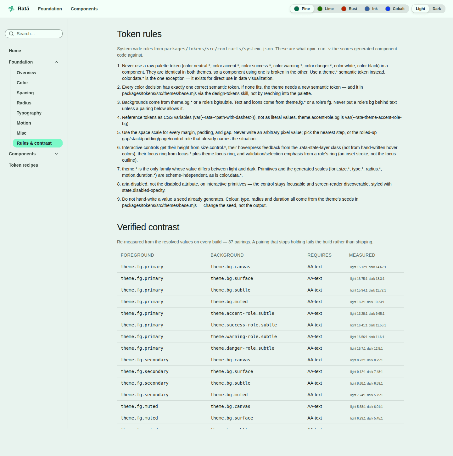
Accessibility is usually an audit — a report, a list of fixes, and a slow slide back. Here it's a build step. Thirty-seven text and background pairings are re-measured from the real values every single build, in light and dark, for every brand. A pairing that stops meeting contrast fails the build rather than shipping.
Disabled controls stay discoverable
A natively disabled button drops out of the tab order and stops being announced, so someone using a keyboard or screen reader never learns the action exists. Ratā marks it disabled to assistive tech and blocks the click instead.
Focus is never removed
Every interactive control draws a focus ring from the same tokens, and never offsets it to zero on a filled control where it would disappear into the fill.
Colour never carries a state alone
A status colour is always paired with a message. Anyone who cannot separate the two hues still gets the information.
Seven brands, one decision each
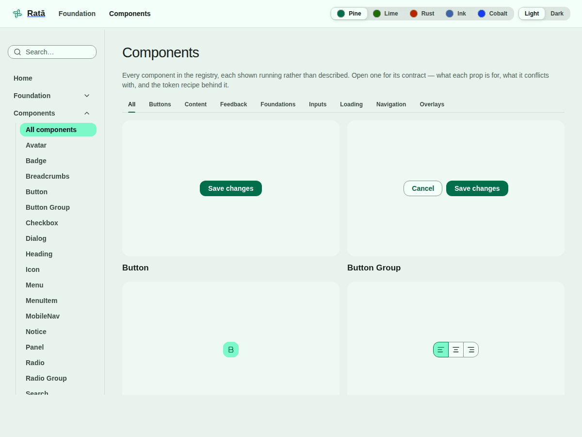
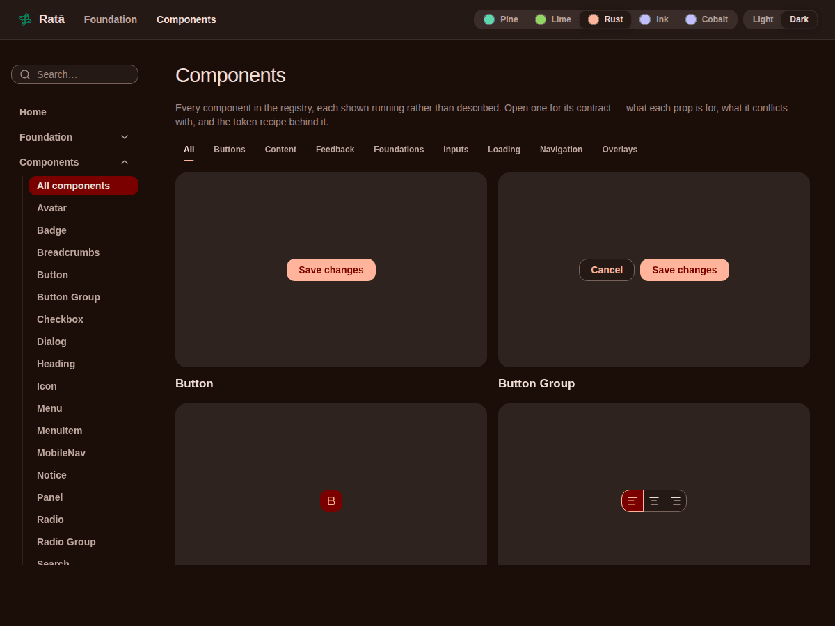
Most of the themes state exactly one thing: the accent colour. Spacing, radius, type and motion all inherit. From that single seed the system re-tones its whole palette — and then re-measures every contrast promise against the new colour.
That's the part I'm proudest of as a systems decision. A new brand costs one choice, and its accessibility isn't a separate QA pass. Two of the themes turn more dials — a warm, high-contrast brand and one with its own radius scale — but they use the same mechanism rather than a fork.
How a component becomes real
Adding to a design system is where most of them go wrong — a component gets styled around behaviour nobody signed off on, then wired to tokens that get renamed once someone actually looks at them. So the order is gated, and each stage is approved before the next one starts.
Behaviour first
What the component does, what it announces, what each option means — approved before any visual work. Changing this later is expensive. Changing it now is free.
Then the token mapping
Each state maps to a semantic token, approved one state at a time rather than as a batch. If nothing fits, adding a token is its own decision with its own interview.
Only then the visual layer
The CSS and the React component are those approved decisions rendered — not a place where new ones get made quietly.
Then it ships, and the checking starts
The moment a component is marked built, the system begins verifying it against the API approved in step one. A prop added along the way and never documented fails the build.
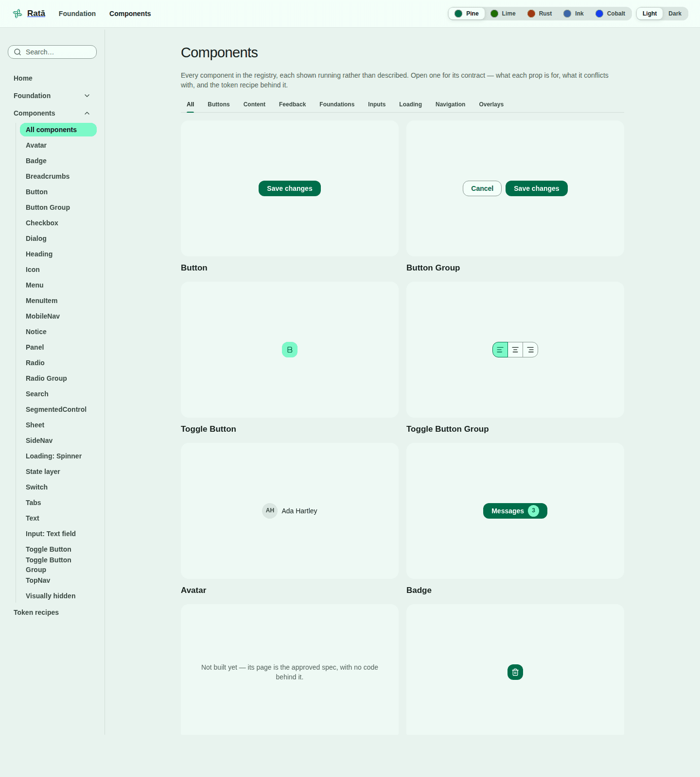
Because the written half of a contract stands on its own, it can exist before the component does — the API gets argued about and approved while changing it is still cheap. Two components are at exactly that stage right now: their pages are live, their options documented, and where the component would render, the gallery says so plainly — not built yet.
Everything publishes where it actually is, including what doesn't exist. The Figma column reads future for twenty-nine of the thirty, in public. A status matrix that only ever reads green is one nobody trusts.
Designing for the reader that isn't human
A growing share of the code that consumes a design system is now written with AI assistance. That reader doesn't browse the documentation site — it recalls the API from memory, and a half-remembered API doesn't fail loudly. It invents an option that sounds plausible, drops in a hex value, hand-rolls a hover state. Each one is a small, convincing-looking defect that review has to catch by eye.
So the system answers questions about itself. Any component's options, its rules, and the tokens behind it can be looked up in seconds — generated from the source rather than maintained by hand, so the answer can't be out of date.
Whether that actually changes what gets written is measured, not assumed. The same twelve tasks are answered twice — once with the token guidance available, once without — and both are scored against the system's own rules: palette colours used where a semantic one exists, hardcoded values, missing focus rings, forbidden contrast pairings. If the difference between the two ever disappears, that's a failure too.